
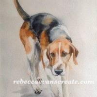
Last night I started a basic dog drawing. I painted the eyes and nose, I wanted them to look as normal as possible, followed then by a variety of coloured washes over the different parts of his head. I then added this morning some random ink stencil patterns, in contrasting coloured distress inks by Tim holtz. Paint brush down, and left to dry, I went out for a lovely forest ride, for a little sunshine, and to get the dog out. Back home I finished off a few more inked patterns, and then added some shadows to give some more dimension, although I didn’t want it to look realistic, I wanted a little more depth. I am really happy with the end result, it is kind of what I had in my head, I am not sure if it should have had a background wash, or if white is ok? But I will leave it as it is for fear of ruining it.

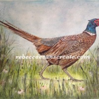
Abstract dog watercolour/ mixed media


Very cool!
LikeLiked by 1 person
This is wonderful – I think leave it just as it is
LikeLiked by 1 person
Thank you for the advice, I think I will
LikeLike
…how charming!
LikeLiked by 1 person
I like the white with the patterns and textures going on in this animal. I would leave it. It’s beautiful!
LikeLiked by 1 person
This is awesome, Rebecca! I have to say all of your abstracts do look a bit representational lol. They are wonderful though! I love the loose and free feeling because you don’t take it too far and it really is stunning!
LikeLiked by 1 person
You are right, they are not true abstract ….. Yet! Lol
LikeLiked by 1 person
Yay, love that word “yet”!!!!
LikeLiked by 1 person