
A friend at work is participating in an abseil for charity. To increase her sponsorship money, she is holding a small raffle at the local pub. I said I would paint one of my whacky colourful hares in the hope this could help in the raising of funds for our local hospice. I was so taken by the wonderful colour combo that Laura at createarteveryday had used in her recent abstract work, so I tried to recreate this as best I could with watercolour and pastel. I decided this hare needed a name to match his cause. There will be many people watching this challenge from the ground…they may not be feeling as terrified as those at the top of the tower, but I hope the ‘fearless watchers’ will all be sponsoring all the brave people standing at the top looking down, wondering what they have let themselves in for! …..good luck to all this weekend, it is a great experience once the nerves pass ( I have done it myself, although many years ago).
here is mr hare, ‘fearless watcher’
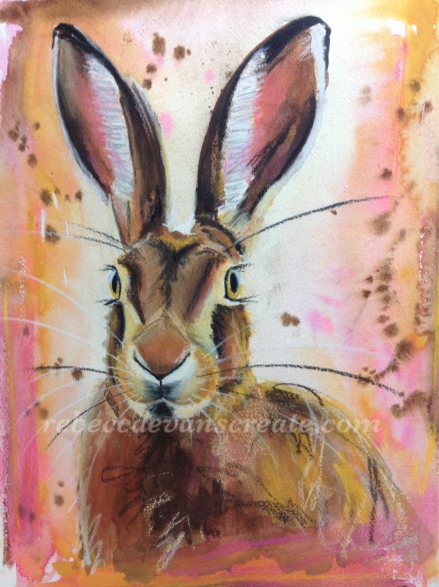
‘Fearless watcher’ watercolour and pastel 28cmX38cm


Rebecca, I love this! It’s priceless! And so perfect for spring! Wow, love your pastel marks. I am so thrilled to have been part of the reason you were inspired to use these gorgeous colors! I hope you’re happy with it as well!
LikeLiked by 3 people
Thank you Laura, how could those colours not make anyone happy, lol, so thrilled you used them the other day to inspire me 😀, I couldn’t quite get the amazing tones that golden gave you, with my stash of watercolour and pastel, but a little mixing helped nearly achieve the colour I was aiming for.
LikeLiked by 1 person
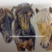
I wouldn’t change one thing about it, Rebecca, it’s wonderful! You’re really on fire lately! I always love your work, but it’s just zinging around like crazy lately!! I’m amazed also that you took colors that would normally not go with a hare and yet made him look so cohesive as part of this work. Just like the rose tones in the horses. They looked wonderful too! Really loving these, Rebecca! Man, I was thinking about pastel over acrylic and now I’m wondering if I should try them over wc! Wow, thanks for the inspiration!
LikeLiked by 1 person
Thank you Laura, it is amazing really that most colours can work with things you would not expect. Why not try pastel over both acrylic and WC? Or also try charcoal over acrylic, I have seen a demo on you tube with acrylic and charcoal, it looked fab ( can’t recall the name, so I could show you) TC, and thank you for all your positive comments😀
LikeLiked by 1 person
Thank you back! I have seen Debora Stewart, that pastel genius I told you about, do charcoal then acrylic and then pastel over top that. Her results are so beautiful, it seemed like the only way to go but I really need to get the blinders off my eyes and realize that art is wide open with possibilities! The sky is indeed the limit!
LikeLiked by 1 person
Oh yes I found the link to show you, not quite the abstract work you are into at the moment, but you can see how they work together…..http://youtu.be/BaTBO9I4JeI. It is an acrylic medium, but you could alter products around, I think the technique would look great in abstract. Have a great day x
LikeLiked by 1 person
Thanks, Rebecca! I like the way she combined the molding paste and WC to make trees! That was really cool. And again, I think I need to broaden my horizons a little bit. I tend to think only of combining acrylic paint with acrylic mediums, but you can really do so much more than that. Thanks for sharing that link!
LikeLiked by 1 person
What a happy painting Rebecca, I love the color. I’m sure there will be someone who want to help the charity by purchasing your lovely painting.
LikeLiked by 2 people
Thank you Sharon, fingers crossed for lots of money being raised 😀
LikeLiked by 1 person
He almost looks like he’s wearing a little bow tie! Just love him!!!
LikeLiked by 1 person
Ha ha, yes it does, how funny that marks on the paper can do that.
LikeLiked by 1 person
Such a happy hare! I am enjoying your color choices just as much as Laura’s. Spring like. Hope Mr. “Fearless Watcher” raises lots of money.
LikeLiked by 1 person
Thank you Susan, Laura deserves the big thanks for the colour choice…..her painting had me captured straight on the first second of viewing.
LikeLike
Oh Rebecca! So gorgeous! I thought something seemed “familiar” about it – and that was it – laura’s color scheme! Oh how lovely a painting and how wonderful a cause. BEAUTIFUL!!!
LikeLiked by 1 person
Thank you Jodi, I could not resist Laura’s colour combo, I was holding it in my thoughts to make it appear on a painting, and this hare was the one. Laura’s abstract work, colour schemes may appear on future paintings, as they keep making me ohhhh and ahhhh.
LikeLiked by 1 person
This is fabulous Rebecca!! I love that you were inspired by Laura’s work…I remember those colors and they were amazing! Your hare looks equally amazing in them. Beautiful work!! 😍
LikeLiked by 1 person
Thank you Charlie, it’s always good to bounce off others. I could not quite match the colour intensity from golden though.
LikeLiked by 1 person
I always love your paintings, each and every backgrounds you paint is unique, very well done 😍 yes I agree Laura has a tremendous sense of color combinations 💕😍
LikeLiked by 1 person
Thank you Snehal, I paint so many brown creatures, or natural tones, so it is refreshing creating these whacky hares introducing colour that usually would not exist in their world. Otherwise some colours just never get a look in with my palette…..nice to give each colour a fair chance, he he.
LikeLiked by 2 people
Yeah so it looks more interesting 👌🏼👌🏼
LikeLiked by 1 person
Love your hare painting! I’m sure it will help bring in lots of donations. 👍🏻👏🏻💕
LikeLiked by 2 people
Thank you, if it means more people buy raffle tickets then it’s all good 😀
LikeLiked by 1 person
I still can’t get over this painting, Rebecca. I just love it!
LikeLiked by 1 person
Aww Laura,you have set me up for a great day, reading your lovely comment, I think this is the result of great team work, keep up your great abstracts, and I will be inspired to turn them into a furby of some sort. I am working on two dogs at the moment, similar style, unfortunately one is short coated, which does not give quite the same effect ( I might just make it hairier than it actually is). I am in a dilemma, I finished the watercolour part, but I am not sure if adding the pastels will enhance, or wreck the dogs? Decisions decisions?
LikeLike
I really like this! I love the touch of pink and warm yellow, a handsome fella!
LikeLiked by 1 person
Thank you vicki, I have just got some prints done of him before he goes tomorrow. Big step for me this printing thing, made some inquiries about cards too, seems very reasonable and everyone tells me it’s a good idea to do.
LikeLike