
I wanted to have a play with the colours that kuretake have with their dual tip pens, they are water soluble and have a brush tip and a fine line end. I love the vibrant colours, and having only a few to plat with I wanted to experiment with the colours and how they blend. I used an old kitchen tile( anything shiny and flat will do) I then scribbled the pens and spritzed with water, I then picked up the colours in the usual way, the tile became my paint pallet!
the watercolour paper was extra smooth ( which I have decided I am not keen on( I didn’t stretch it unfortunately and it buckled and warped more than any of my other card stocks have)
I drew out the hare in permanent pen 0.3 black, and then painted on the inks. They seemed to blend very well, In fact some nice effects, my colours were restricted, so although a little odd looking I think she is fun. Because of the buckling that was caused when I did the background, I found I had lots of pooling, which was hard to manage, but the colours were lovely and subtle, only thing was it was harder to get some darker tones of the same colour. Maybe it is possible and I just need to practice with them more, or maybe I need to buy different shades to achieve the darker tones? However they are on the pricy side, so I will have to think about that ( they do work better than some similar makes I have(stampin up and Heidi Swapp) Lots of fun though
It just had to be another hare!
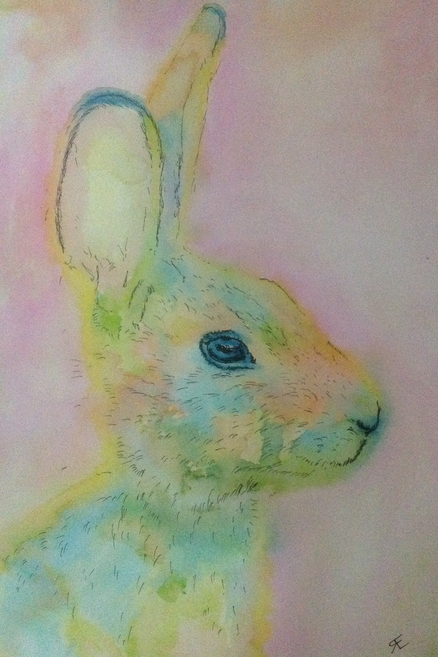
Watercolour hare using kuretake dual tip pens rather than traditional watercolour, scribble ink onto a shiny tile and lift traditional way with brush to paint- nice vibrant pastels. Black permanent ink outliner


The big word these days (heard it twice today) – Precious – and this is!
LikeLiked by 1 person
Might layering solve the problem? I love the end result, btw. And good idea for your counter top palette.
LikeLiked by 1 person
That could be a good plan, although I had so much pooling on this particular hare, so decided to stop,I might try with the next, and stretch this smoot card next time…… Or just staple it to a board?
LikeLike